Win a $100 Lowe's gift card at French Country Cottage...good luck!
http://frenchcountrycottage.blogspot.com/2012/04/lowes-giveaway.html

Sunday, April 29, 2012
Tuesday, April 24, 2012
Think Pink! (in the *living room*?)
My initial thoughts on my living room were to use pale neutrals like creamy white and pale gray. My "centerpiece" is this sofa - my mother's Duncan Phyfe-style sofa:


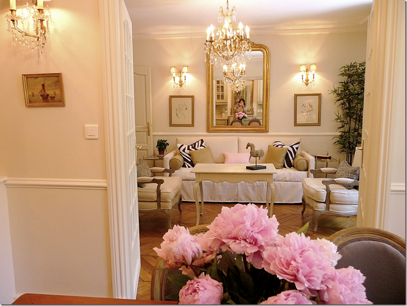
I love the tone on tone pales - I plan on using a lot of crystal and silver for accessories and I don't want the room to be "glacial" - you know...like Mr Freeze's lair.

Here, I like the use of the gold; I am hoping to use silver and pale blues/grays/violets to a similar effect.


When she had this reupholstered in the early 1970s, she had the excellent taste and foresight not to have it done in avocado green. It's an oyster white silk brocade with tiny pink petit point roses.

I love the tone on tone pales - I plan on using a lot of crystal and silver for accessories and I don't want the room to be "glacial" - you know...like Mr Freeze's lair.
Here, I like the use of the gold; I am hoping to use silver and pale blues/grays/violets to a similar effect.
This is probably the most "realistic" version of what I'd like to do. Again, the pale neutrals, but not icy. I would also definitely consider a painting over the mantel instead of a mirror.
This is a "I wish" photo. I wish I had room for shelving on either side of my fireplace, but I am not sure how I could accomplish that given the minimum shelf depth:

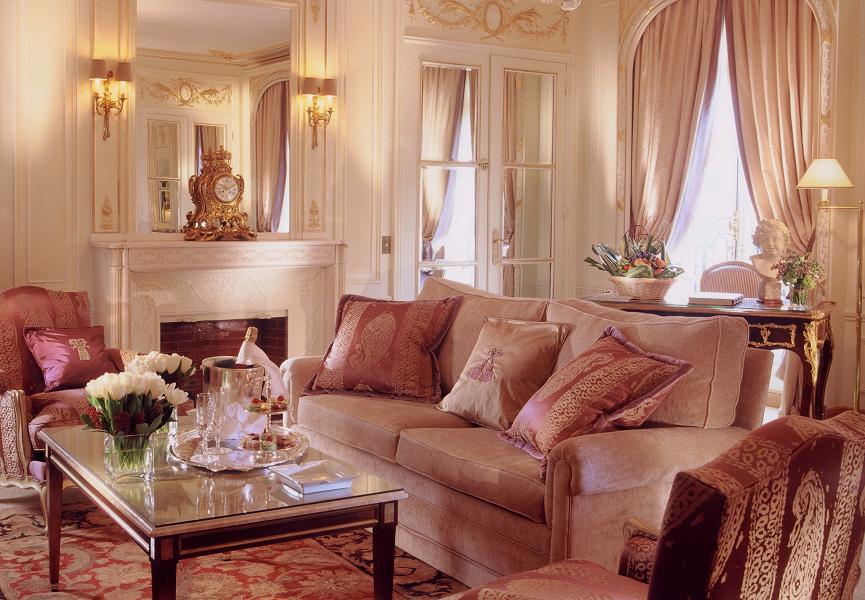
These last two photos are beautiful. I love certain shades of pink, but I am frankly scared to have a pink living room. My bedroom is going to be "White Dogwood" by Sherwin-Williams, so I have no qualms about rosy boudoirs, but I don't know if I can bring myself to put it out "in public". But...why not...it's just some paint, right? :)
By the way - this last photo is of the Prestige Suite at the Plaza Athenee in Paris. Nothing like having champagne taste and a diet Pepsi budget! ;)
So - what do you think? Should I stay neutral, or think pink? I know what Kay Thompson would say!
Saturday, April 7, 2012
My "Splendid Blender" dilemma :( - UPDATE!
When I saw this transfer method on the blog of the goddess who is Rosemary Barnes, I was intrigued.
Because I live in Hooterville, I couldn't find them at Michaels', so I searched the intarwebs for one of them there ChartPak Splendid Blenders. I probably could have taken the Cannonball Express over to Pixley, but I figured I could do it online since Alf & Ralph Monroe got the DSL connection workin' here.

I couldn't find one to save my life. I *did* find a ChartPak Blender, so although it did not proclaim its splendidness on the label, I ordered 3.
They don't seem to work. Does anyone (A) know what I'm doing wrong (I'm using a toner copier print, not an inkjet print), (B) if this marker is the same thing as a Splendid Blender, and (C) what time the next train to Pixley arrives?

Because I live in Hooterville, I couldn't find them at Michaels', so I searched the intarwebs for one of them there ChartPak Splendid Blenders. I probably could have taken the Cannonball Express over to Pixley, but I figured I could do it online since Alf & Ralph Monroe got the DSL connection workin' here.
I couldn't find one to save my life. I *did* find a ChartPak Blender, so although it did not proclaim its splendidness on the label, I ordered 3.
They don't seem to work. Does anyone (A) know what I'm doing wrong (I'm using a toner copier print, not an inkjet print), (B) if this marker is the same thing as a Splendid Blender, and (C) what time the next train to Pixley arrives?
UPDATE: I underestimated the importance of burnishing after using the blender pen. One of my mother's vintage cream soup spoons did the trick!
Sunday, April 1, 2012
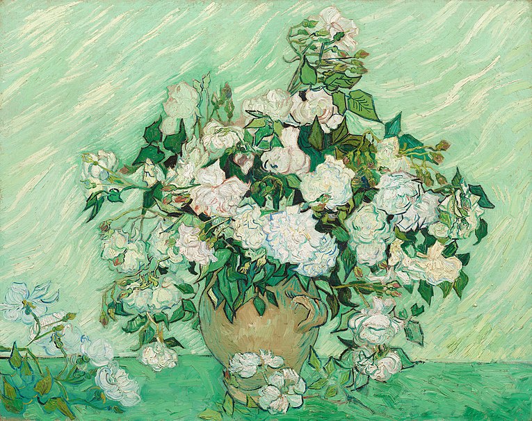
I wonder if VanGogh had these issues?
This weekend, I was fortunate enough to see the VanGogh Up Close exhibit at the Philadelphia Museum of Art. It was just beautiful and sad and inspirational at the same time.
Spending the day surrounded by color made me even more unsure of what to do about my living room/dining room/small foyer. I rent, but have been here 2 years and plan on being here for the long-term. I have terrific landlords who realize this is my home...not just some place I live. I take very good care of the place, and I am very happy here. My landlords are perfectly fine with me painting the walls. They are currently (I think) "Navajo White", and while that's perfectly fine, I want to change it.
My decorating colors are cream/oyster white/pink, with some touches of pale green, and I have a lot of silver and crystal decorative pieces. The furniture that will not be painted are have cherry tones. My dilemmas are:
- because my colors are pale, and because my accents are silver and crystal, I am concerned about everything looking "washed out", or cold.
- because everything is pale and delicate, I don't want any extremely vibrant colors.
- I am "stuck" with the following non-negotiables/non-changeables
- a natural pine floor that unfortunately, like a lot of these floors, has an orange cast to it.
- a terra cotta tile floor in the foyer
- Eisenhower-era wood door & trim for the foyer closet
I have several paint "swatches" on the wall (thank goodness for those little pint samples!) "Silver Screen" by Behr seems too foggy gray. "Quietude" seems more like a brighter white than the Navajo White that's up there now. Sherwin-Williams "White Dogwood" is a beautiful barely-there pink, but I think that will be better in my bedroom.
Does anyone have any thoughts or suggestions? Anyone...Bueller? I could go broke on pint samples before I figure this out! Does anyone have a "go-to" cream or pale oyster color they really like?
Help! :|
Subscribe to:
Posts (Atom)